Gene Cox Grocery

This summer I was contacted by Gene Cox Grocery to see if I’d be interested in designing a simple website for their business. I’ve been a regular customer and in-and-out of the place for the better part of a decade, so I was happy to work on something for them.
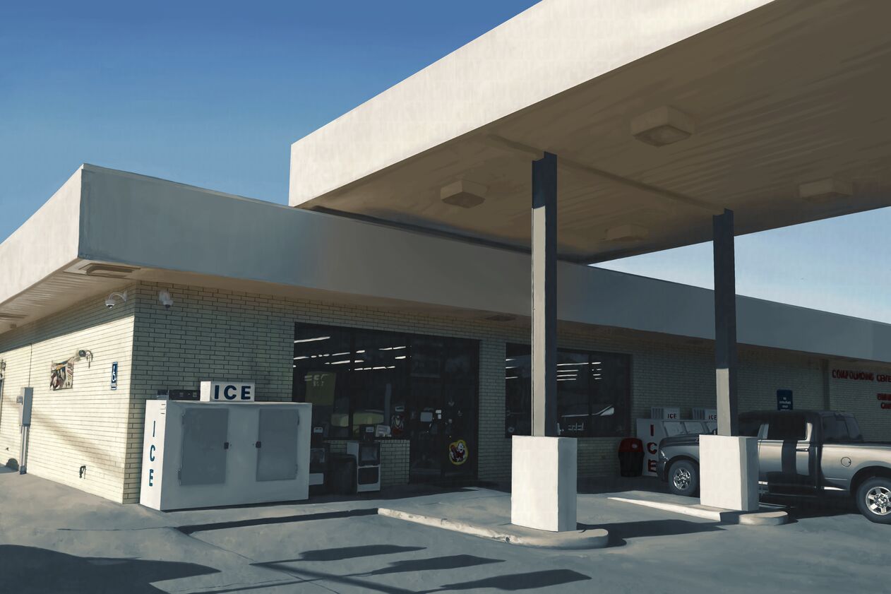
I first started out with an illustration showing their building front. It is meant to evoke a feeling of times gone by as if it is an older photograph. The work was painted in ArtRage and composited in Adobe Photoshop.

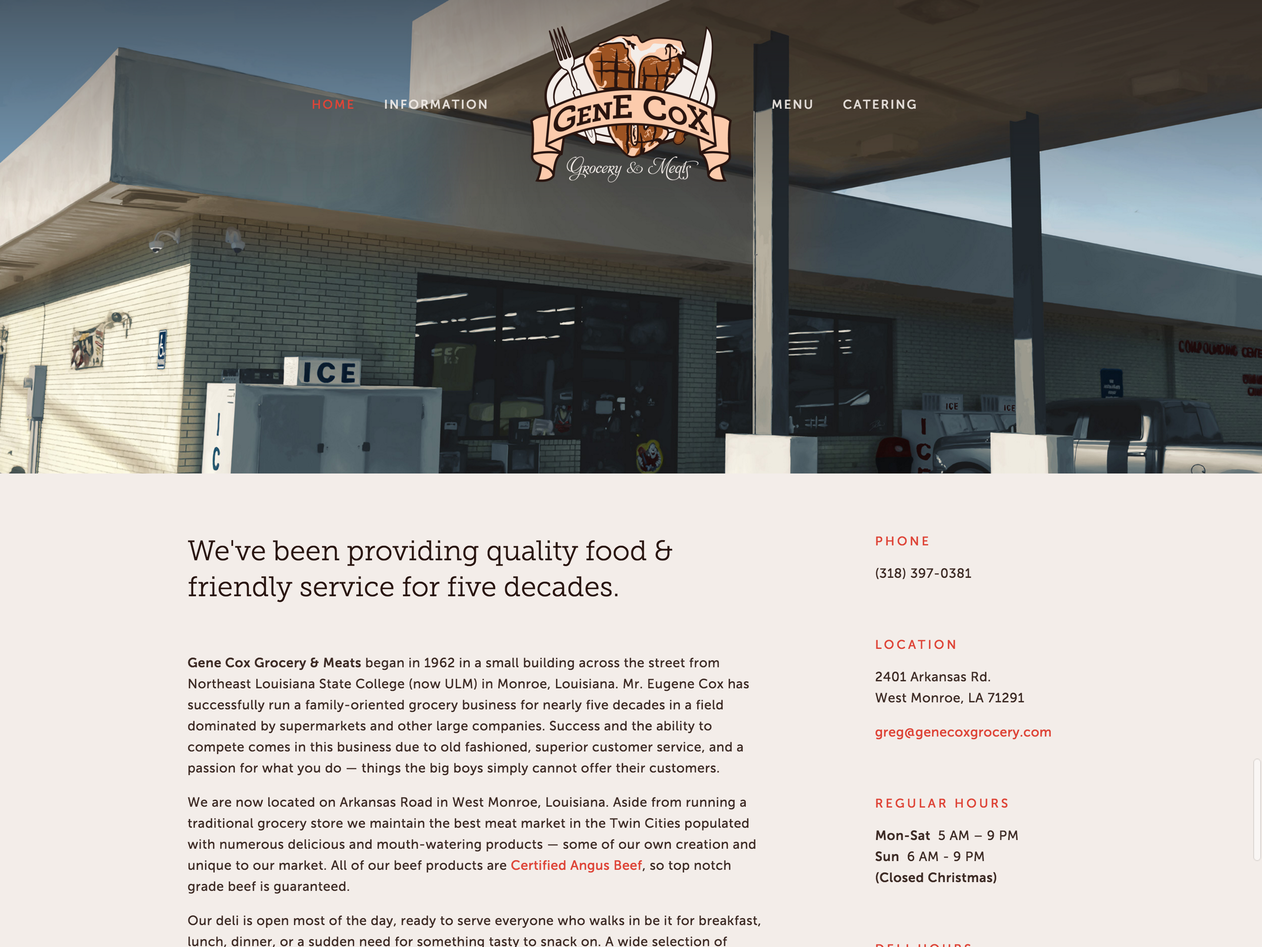
The website design was the biggest part of this project. The main design goal was to create a unified identity for the business using the website’s design and the illustration as its starting point. The illustration’s color scheme is used throughout the website, making everything blend well together via color. There’s no really saturated colors in the design because there’s no really saturated colors used in the illustration’s color scheme.
The website is a simple single page layout. It’s all that is needed. There’s not a dearth of content, but there is no need to organize it into multiple pages. Along with the design goal mentioned earlier there was a technical goal of the website’s content being able to be editable by the staff for updating prices and specials. The most cost effective way to accomplish this for them was to host it through Squarespace.

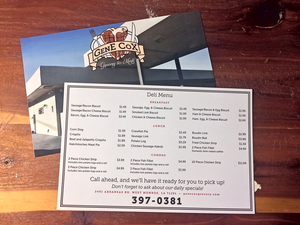
The design identity carried over when they wanted flyers printed to post around town so people could call in to-go lunch orders. They wanted flyers which would stand out, so they were printed on card stock and coated on both sides. Amongst a group of poorly-printed and badly-designed flyers on technicolored paper they should stand out. Because of how they’re printed they also serve another purpose — as menus inside the grocery store itself.
This project is ongoing. There is more work to be done, and I will update this entry as each task is completed.
You may find their website at genecoxgrocery.com.